Design With a Difference
Posted on Jan 17, 2015
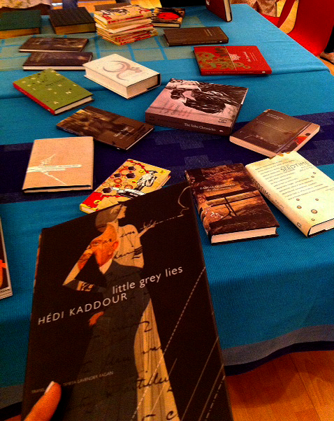
As budding editors and designers, or both (yes that happens), we were only two classes old at the Seagull School and it felt great to judge books by their covers, and not be judged for it. Wednesday’s design roundtable brought on the fabulous learning and unlearning: about how design comes about, and makes it to our favourite book covers.As part of the discussion, everyone from the core team at Seagull showed us their favourite book covers, sharing stories about the experiences of working on those books and, sometimes, how the outside of it drew them to what was inside. During the course of the discussion, every preconceived notion and idea about design lay dismantled. With every gorgeous book cover came the stories and struggles associated with the art of merging content with befitting images, to eventually create something that enables the reader to instantly connect the two. It was particularly fascinating to know how Sunandini created most of the incredible designs, simply with the help of the information provided on the blurb. The magic of these designs lay in the fact that as a reader, I could either marvel at how well they fit in together, or look at one of those images, and want to know the story behind it.
One of the most fascinating books we talked about was a classic by Roland Barthes called Incidents; its new English translation was published by Seagull, with photographs appearing alongside the text. The photographs were taken at locations ranging from Morocco to Varanasi, and became symbiotic with Barthes’s iconic essays. It was very interesting to note how broadening of horizons and perspectives could enable contrasts to exist alongside each other, almost giving them new meaning in the process. Some of the photographs did not come from the same geographic landscape as the essays, but the sheer universality of the written content and the images made it possible for one to give a new lease of life to the other. A photo that looks exactly like a place described, a feeling that finds expression in the written word. We learnt that as editors and designers, it was also imperative to not be overwhelmed by the work at hand, in terms of its stature, or its voice. It is essential to lend your uniqueness to the job, with an individualism that stays with it for posterity. Until I started school at Seagull, I used to believe that being a specialist in design had to do with artsy skills, coupled with design-school expertise. Since I couldn’t draw or paint to save my life, I was almost certain that I would not be able to engage with it, more than just appreciating art. However, as we sat and talked about design and all that inspires it, we realized it comes from who we are, and what we do, everyday. Art and design did not belong to a separate impenetrable zone; it was everywhere, from the interiors of our homes to the colours in our outfits. Of course, there existed an interface that made it easy to express one’s aesthetic ideas, especially when it comes to design but most importantly, it came from being alive to and aware of the beautiful things around us. As I left class, I found myself thinking that though words gave me the comfort of the familiar, I could maybe sometime dabble in design. Book-design and editing complemented each other; neither was an isolated art. As an editor, nothing would make me happier than seeing a book literally go from cover to cover in all its glory. With motifs, colours and collages.
The design roundtable opened up a lot of doors, to imagine and question but, most importantly, it led us to notice a window that was open all along. Truly, it was about learning that there’s still a lot left to learn.
Aastha Sharma
Leave a comment ×