Cloud Gazing
Posted on Apr 04, 2014
I have come quite a long way since my last post. More than dozen and a half design assignments old as I write, the sense of wonder has increased manifold. Progressing from designing covers to typesetting the pages they enclose, the experience has been nothing short of enriching. Each assignment has been special in its own way, but the one that remains special to me is designing the cover of German poet Hans Magnus Enzensberger’s collection of poems (99 meditations) entitled A History of Clouds.
Reading the blurb and a few of his poems that were given to us as brief to design the book cover, what immediately struck me was the way Enzensberger brought out the sublime in the simple. Simplicity isn’t simple. To translate 'the most fleeting of all masterworks' into a coherent and meaningful design was the biggest challenge. Moreover, the book already has a beautifully designed cover by Sunandini. I couldn’t imagine going anywhere near, but I had to start somewhere. So I started downloading images from the Internet (without any clear idea of what I would do with them), based on the essence of each of the poems that we were given. After completing the basics of converting the images to the required formats and resolution (which took quite a bit of time for a novice like me with almost thirty images at my disposal), I began arranging the elements on the cover. I discarded most of the images and about three or four ideas because they were not shaping up the way I wanted them to. I felt intimidated by the simplicity of the poems and frustrated by my inability to give shape to an appropriate cover design.
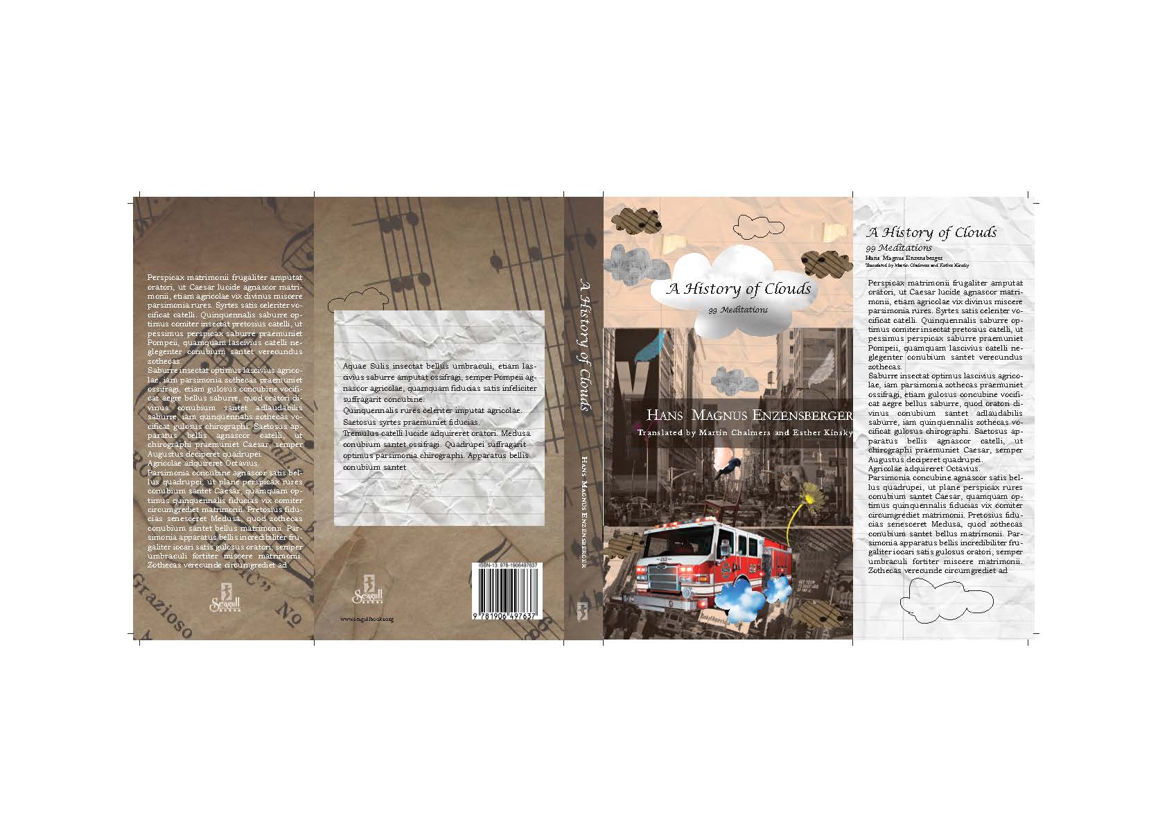
Ultimately, crumpled paper was all it needed to get me going. What kept looming large at the back of my mind was Enzensberger’s observation and celebration of the quotidian everyday constituted by objects that are indispensable yet taken for granted in our routine. Paper in any form, state, shape and size would be an apt signifier, according to me. So I went ahead and used crumpled paper as background for the gate flaps of the dust jacket and stained paper with printed musical notes for the front and back covers. To this watermarked background I added an image of a city street during rush hour and added random elements taken from a normal day-in-a-life scenario—bag, chair, cars and a bird surveying it all from atop a lamp post. The clouds floating past, carrying the everyday.
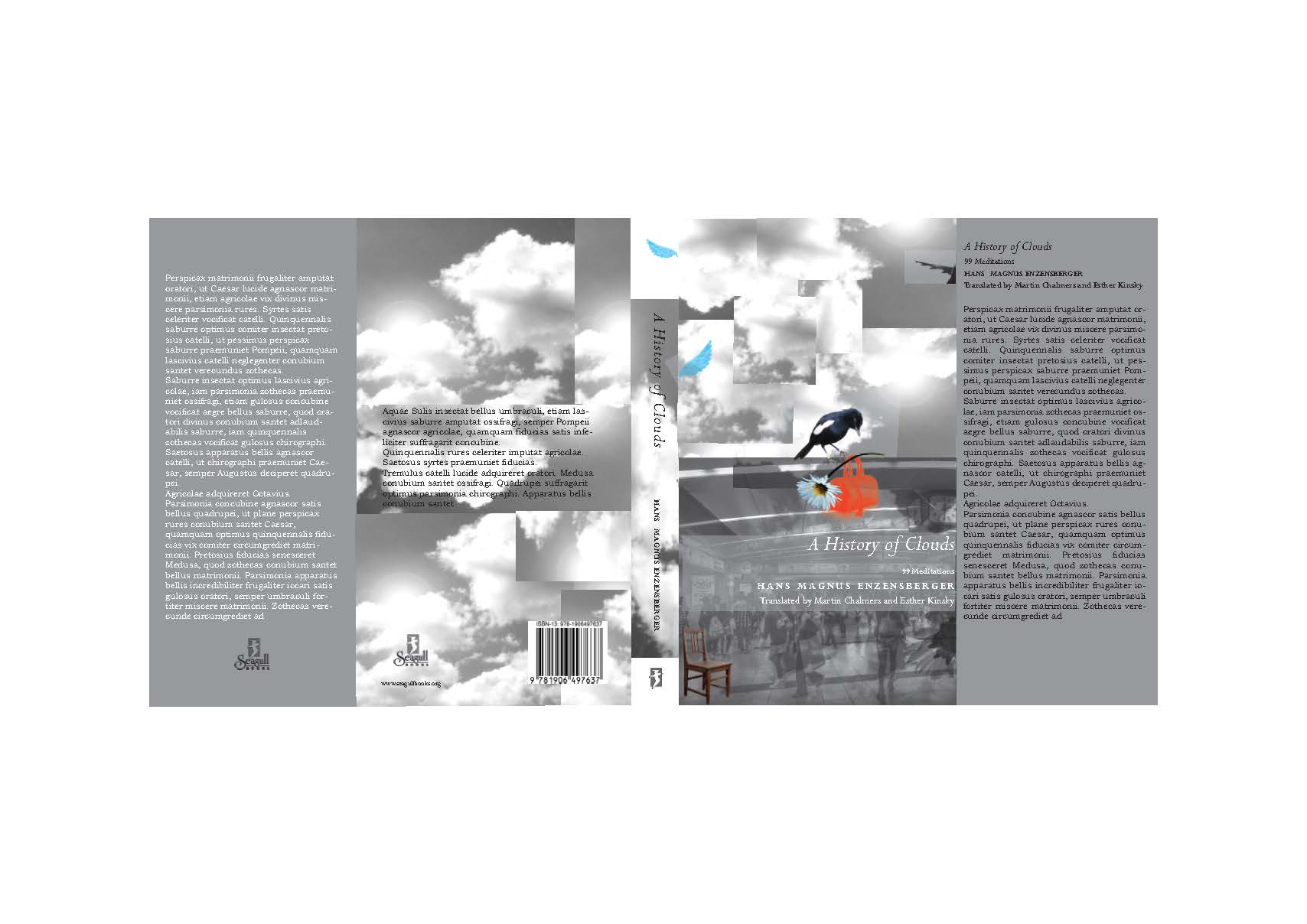
I actually went on to design a second cover—tiled black and white images of clouds and a crowd of people below rushing towards unknown destinations and a coloured image of a bird looking downward. In both, I tried to create a collage that would capture a whole gamut of actions, emotions and sensibilities alike—colour, half tones and sepia. Ambitious, but a greatly satisfying mental and aesthetic exercise I chose to believe.
It was delightful to see the varied interpretations each of us had to the poems and the enthusiasm with which each of us worked on it. The diverse responses lent a lot of perspectives and Sunandini’s comments were insightful, as always. Propelled by these unforgettable experiences to the end days of the course, I take back a wealth of lessons and a belief in cloud-gazing.
Darshana Ghose
Leave a comment ×