’Cause Everything Is Design: A Conversation
Posted on Feb 22, 2018
Shashank Bhargava
After multiple failed attempts of trying to come up with something for this blog post, which is meant to be about my ‘experience of grappling with the nitty-gritty of learning design’ at the Seagull School of Publishing, I ended up having the following conversation with my girlfriend, Swati, trying to figure out how I should be going about it.
Swati. I think you first have to figure out what are the issues that you faced. You can’t gloss over them because otherwise it becomes just any other design student’s account. It has to be personal enough—why did you have those problems?
Shashank. Personal? Hmmm. Well, for some time I thought since I had only paid Rs 10,000 out of the Rs 50,000 for the course and I could still back out from the course. Because I’m not a designer, I have no background in design and that I don’t fit in. There are people in the class who paint or draw or have studied in Srishti and I have not done either, so that used to be quite intimidating. Plus the decision to join the course was kind of impulsive. So I’d think about leaving every day. I don’t know how serious I was about that because I don’t know if I would have actually left.
Swati. Did you not leave because you thought you’d get to learn or because of inertia? As in, now that you’re there you might as well do it.
Shashank. Learning, yes. But also because it reflects poorly on you when . . .
Swati. . . . you leave something.
Shashank. Yeah. Then you’re a quitter. You didn’t even give this a fair shot. But, when I designed the first cover and I compared it with the others’, I thought it wasn’t that bad.
Swati. You were thinking about leaving even before the first cover?!
Shashank. I did think about it. And I thought that even after the first one, but that first one had given me a slight confidence.
Swati. What is the cover that makes you feel like—I can do this?
Shashank. Maybe the Panchtantra cover.
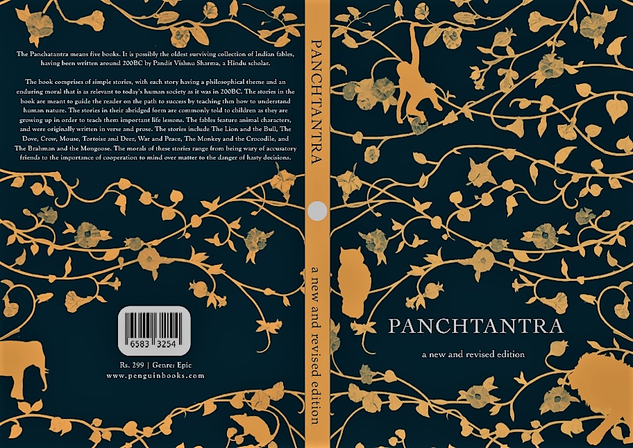
Swati. That is actually pretty professional.
Shashank. Well, yeah, it does look professional but this is exactly what I didn’t want to do. Because this leafy pattern has been done to death in books like Aesop’s Fables or Penguin Classics. But it still looks alright.
Swati. What about the Jeet Thayil one?
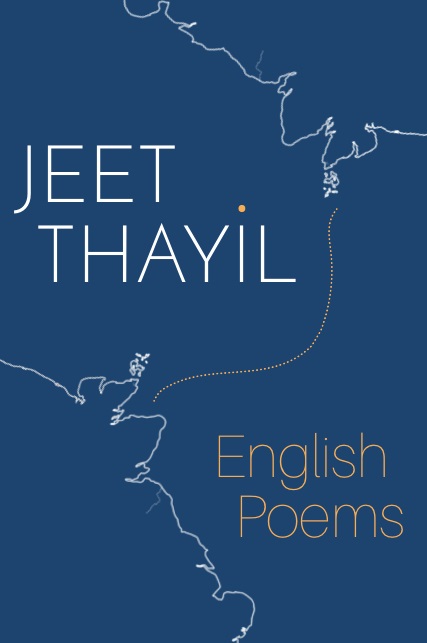
Shashank. I like the idea of it, but I don’t think it can go for print.
Swati. Yeah, I think so too. It looks like a draft right now.
Shashank. I think the colours need to darken a little, the outline needs to be highlighted more and I think another element needs to be placed here. I was thinking of adding circles here . . .
Swati. What about textures? You haven’t worked with textures yet.
Shashank. Yeah, not at all. All my covers—and I was also telling this to Sunandini [Banerjee] today—that all my covers are two-colour. And she said, ‘Great! You’ll be saving someone incredible amounts of money!’ And in fact even for today’s assignment, we had to bring a textile from home, scan it and use it to design a cover. So I borrowed my landlady’s sari for it. So now the image that I’ve used obviously has a texture but again I’ve reduced it to two colours.
Swati. Yeah, maybe this can be your thing but this can’t become your limitation. The reason you’re doing this can’t be because you can’t work with more than two colours.
Shashank. Yeah. I think for the next cover I have an idea where I will be using more than two colours.
Swati. Hmm, that’s also part of your growth, I guess. Earlier you couldn’t do it and now you can or at least that there is potential.
Shashank. I think another reason that I didn’t leave or didn’t want to leave is because this is a cool place. Plus it’s been a long time since I’ve been a student. That’s something I’ve not experienced since college. So learning something with other students or hanging out after classes and the school itself is a great place to be. You enjoy spending time there and look forward to coming to it everyday. Plus, I’m staying in Kolkata which is something I always wanted to do. Actually experiencing Kolkata.
Swati. So what are you finding the toughest about designing a cover right now? It is the font? I see you’re using similar kind of fonts.
Shashank. Yeah, I have a preference for sans-serif fonts. And Sunandini also noticed this and told me that I should branch out. And for Panchtantra I used a serif font because it can do with a decorative sort of font, but I don’t like serif fonts because they look old for some reason.
Swati. Any other aspect?
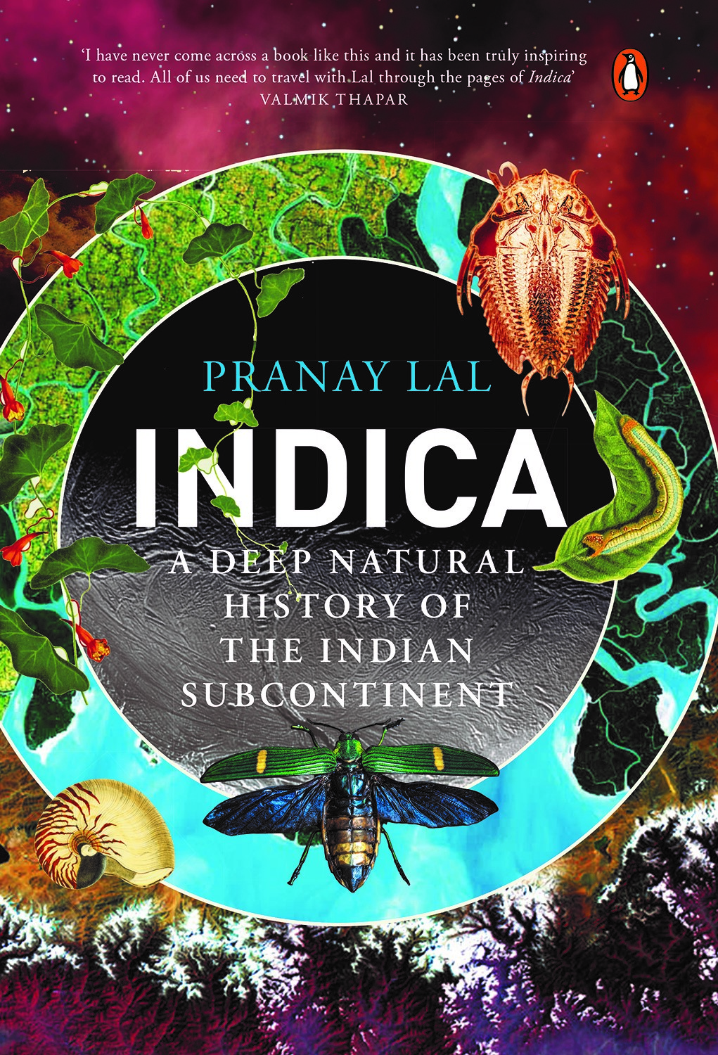
Shashank. I think we will get a collage assignment and I have no idea how I’ll fare in that. For me I think it’ll be putting a lot of things together in a cohesive way—that’s what I would find really hard. My covers right now are relatively minimalist and so, for example, the cover of Indica by Pranay Lal (designed by Gunjan Ahlawat)—that’ll be really hard for me to do. Those are a lot of different elements coming together and beautifully so. Those images were provided to him by the author but the way they’ve been put together—that I think would really hard for me to even reconstruct.
Swati. That I think will come with a lot of technical knowhow.
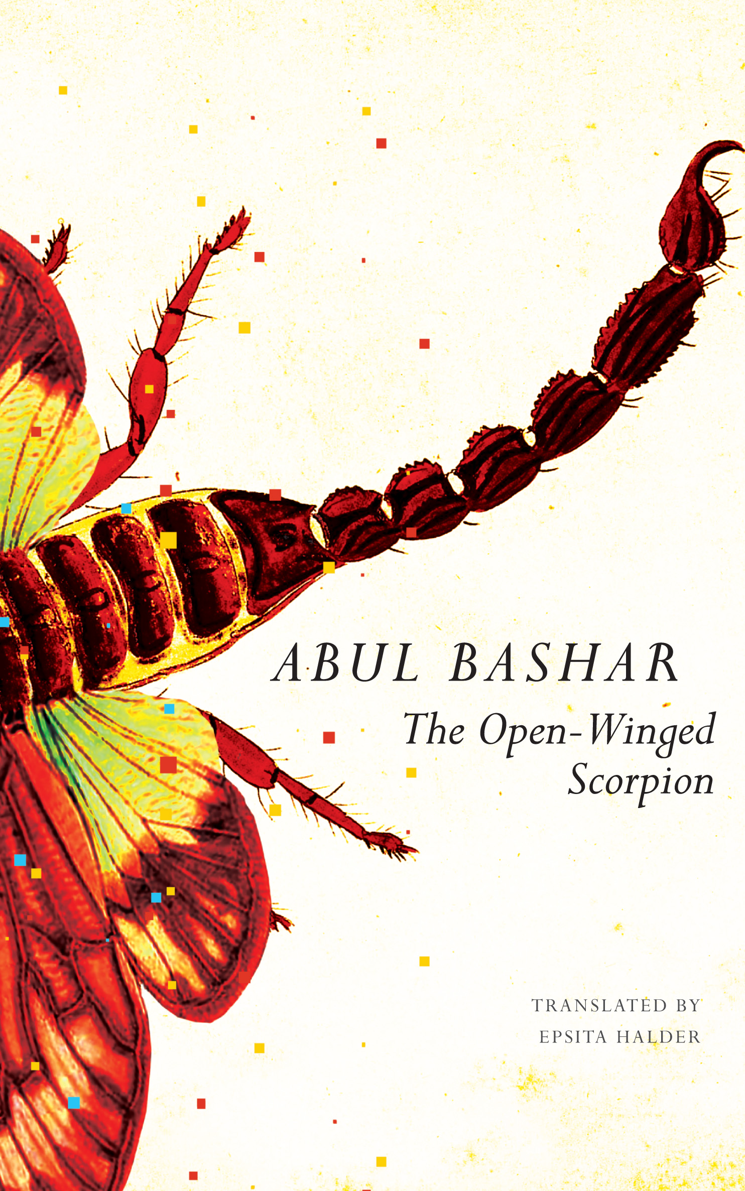
Shashank. Yeah. Like for Panchtantra I wanted to use different animals but they were all illustrated by different people. So if you put them together, they clearly seemed like they are from different places. So I’m sure there’s a way in Photoshop to make it seem like they are from the same place. I think that’s what Sunandini did with the cover of The Open-Winged Scorpion. Hmm, maybe I should try to construct that cover.
Swati. So you started with being interested in covers and generally a little interested in design. Where are you now?
Shashank. Hmm, maybe it’s not very ambitious but right now I feel I can design a cover for a small place. Like for small regional publishing houses. A lot of them don’t have good covers. Or company brochures. A lot of them are very sad.
And one thing that has definitely changed is how I look at design. Like earlier, I’d like a cover but now I find myself deconstructing it, trying to figure out how it was made, which is also something we do a lot in class. And I love that part. Those are times I wish the class didn’t end. And also colour. In every cover, you have to take the decision of what colours to use—so just keeping a lookout for them.
So now when I’ll be watching a movie and I’ll look at a wall or a couch, I’ll be like, ‘Oooh, that’s a very interesting green.’ So I’ll screenshot it and see if I can use it somewhere. Or you come across some font . . .
Swati. Oh, that’s a big change.
Shashank. Yeah, ’cause everything is design.
Swati. And it makes you appreciate the world a little more, doesn’t it? And now to be able to look at something and be like, ‘Oh I think they should have used another font’ or ‘They shouldn’t have put that there.’
Shashank. That’s something that I would always do I think. But this course gives the answer to those questions. About what are the different kinds of things that can be done.
Swati. But do you think anyone can do design? Or, rather, do you think design can be taught?
Shashank. I think techniques could be taught.
Swati. So what can’t be taught?
Shashank. I think . . . aesthetics can’t be taught. Your cover can be technically good. Title is clearly visible, crop marks are in place, images that you’ve used are of good resolution but still it doesn’t look pleasant. I don’t know how that can be taught. You can have some broad rules. Like, say, in fonts, Sunandini would tell us not to use Helvetica. Apart from the fact that it does not look great on covers, it’s also the default font that QuarkXpress gives you. Using it means you didn’t put any effort at all. And sure you can be told not to use Comic Sans or Arial for that matter, but I’m not sure how one will teach how to use a font that matches the overall design of the cover. But we are yet to have a class on typography—so let’s see.
Swati. I think design course is a tough place to know if you’re good or if you’re good as per lots of people.
Shashank. I mean, even in art, if a large number of people find something good, then it’s considered good. Or if critics, whose opinions are respected, think it’s good, then it is considered so. And the difference between a painting and book cover is that a painting is an artist’s expression while a book cover is supposed to visually represent another artist’s work and make it marketable.
Swati. Yeah, a cover is representing a content while a painting is the content.
Shashank. It’s like how Sunandini says that as designers you are problem solvers. That she’d rather we don’t have a style so that we can design for any kind of book or project. Designing a cover is an artistic solution to a marketing problem.
The problem that I also struggle with right now are meeting deadlines. For me it’s like, I’ll design something and it won’t work out and only then I’ll come up with something else. And that for me takes a fair amount of time right now. Like the first Rupi Kaur cover I designed for an assignment was absolutely shit. Now when I open the cover I’m really embarrassed. We had a deadline for it and I had submitted it in a panic but then Sunandini didn’t end up seeing my cover on that day. But the idea that Sunandini was going to open that cover and it’s going to be projected on the screen for everyone to see . . . I was shaking! And then the next day I came to class early and I think within 10 mins or so I designed something much better. And then I requested her to take this file instead. The worst part was that I think that cover was problematic and the idea that everyone is going to see it . . . my hands were shaking while holding the mouse.
Swati. It’s interesting that you are so passionate about this.
Shashank. Passionate? I don’t know.
Swati. You can call it whatever you want. But hands shaking is a very . . .
Shashank. I think I’m just nervous in general.
Swati. That’s not true. And you know even nervousness requires a lot of investment, right?
Shashank. Yeah, I guess. But that I am. And I think the impression that people in general have of me in class is that I’m always fretting. And in the end Sunandini will open my cover and say, ‘Arré, why were you fretting? This is fine.’ I think it’s the idea that your cover is being judged. And I know that it’s just your cover that’s being judged and not you, but it’s hard to distance yourself from that.
Swati. Yeah, I think very few people would have. And apart from overconfidence, maybe it would show that you’re not much invested in what you are doing.
Shashank. Yeah, but it’s different when you relate it to your self-esteem.
Swati. People react in their own ways but very few people don’t feel anything. Others are just better at hiding it.
Shashank. Yeah for me it shows. Because even now when I think about what if Sunandini would have opened that cover and ‘Oh God, what would she think of me?!’
Swati. It’s interesting that in the Rupi Kaur cover assignment, you set yourself your own deadline—the actual deadline you had already missed—but you had to come up with something before Sunandini could open your cover.
Shashank. Yeah, a lot of things happen when you’re just trying to avoid falling flat on your face. That’s kind of motivational.
Also, I think this point could come at the end of the blog post.
Swati. Yeah, I think so too.
Leave a comment ×
1 comments